Child Mind Institute's new visual brand and Family Resource Center
Design System · Web Design
My Role:
Lead UX / visual designer for the new brand identity, and web design
Key Outcomes:
- New and returning users are more likely to visit the Request for an Appointment (+486% increase).
- The site also had a +14.9% increase in the number of visits from Spanish Speaking users.
Agency: Constructive
User research, testing, and analytics informed every UX decision
The new website's structure and pathways make it easier to accessing mental health resources and care options. The updated Content Management System (CMS) expanded the editorial team's vision and ability to make related content connections. The new site reachs a wider more inclusive audience with a focus on rural, low-income, and latinx audiences.
The information architecture and wireframe phase of the project was informed deeply by several research key activities:
– Developed analytics insights based their current traffic and conversion goals
– Audit the current content (over 2000 articles and guides)
– Develop audiences personas and journey mapping
– Held Stakeholder workshops and interviews
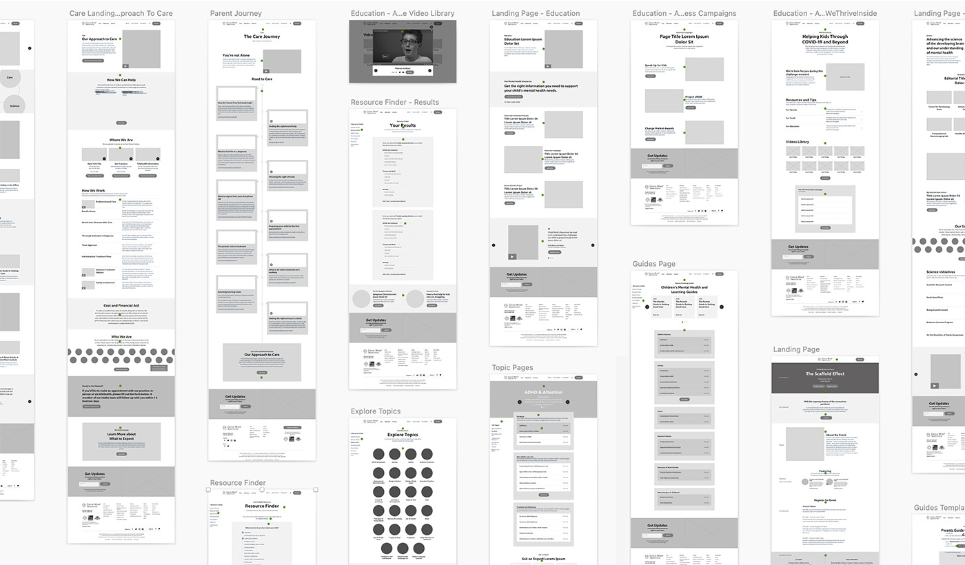
We developed and tested wireframes based on their digital service design, mapping people who are curious about children mental health to actively booking appointments and sharing helpful resources. Our wireframes were influenced directly through several rounds of user testing, ensuring the right audience knew exactly where to access the right information
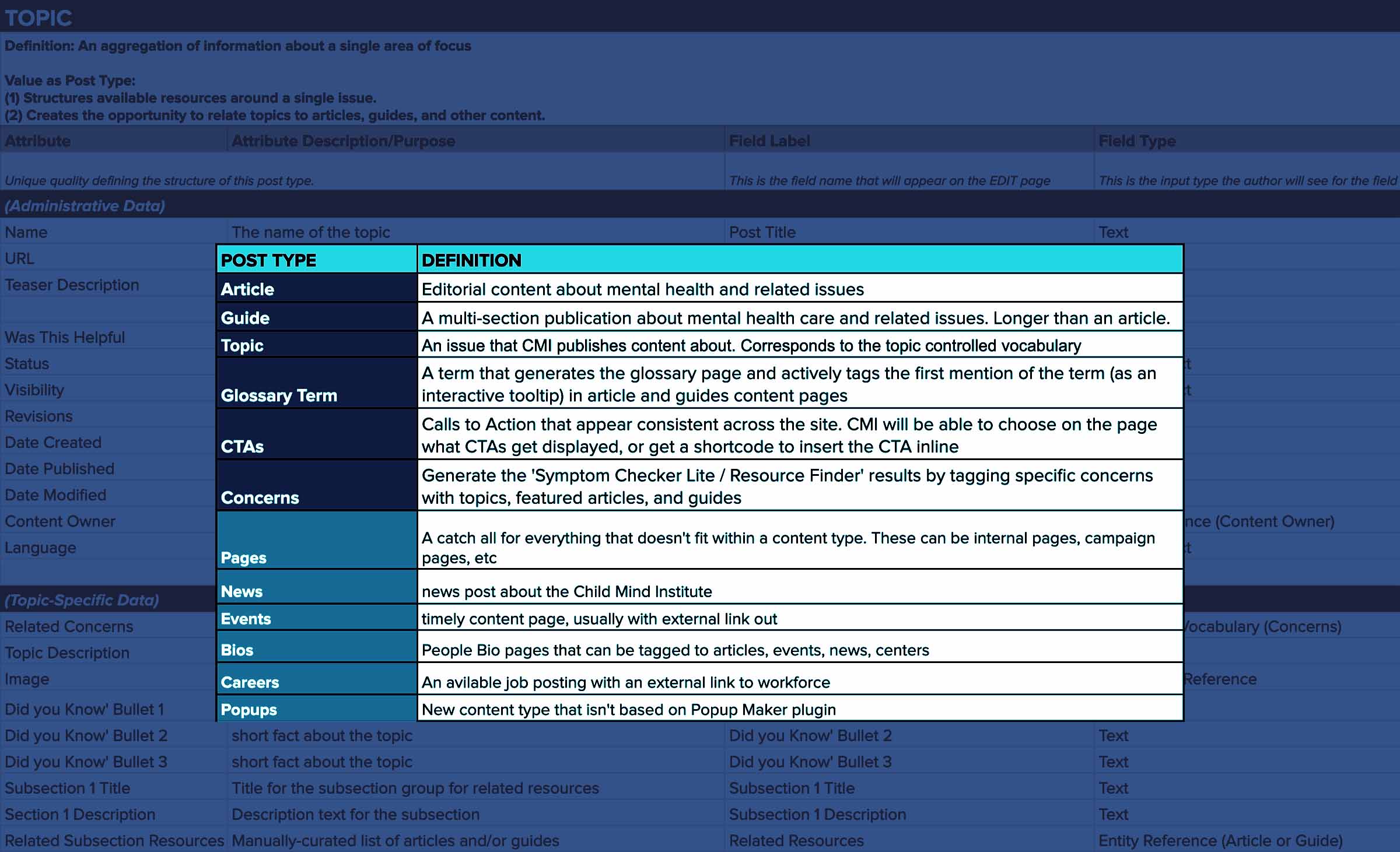
Documenting the Backend
We made an extensive spreadsheet outlining all the content-types and taxonomies on the current and new site's Wordpress backend. This allowed the client, project team, and external developers to be on the same page about content requirements. And we knew what exactly we needed to migrate to the new site, which saved a lot of time cause CMI had over 2,500 existing articles and guides.
Establishing the New Brand
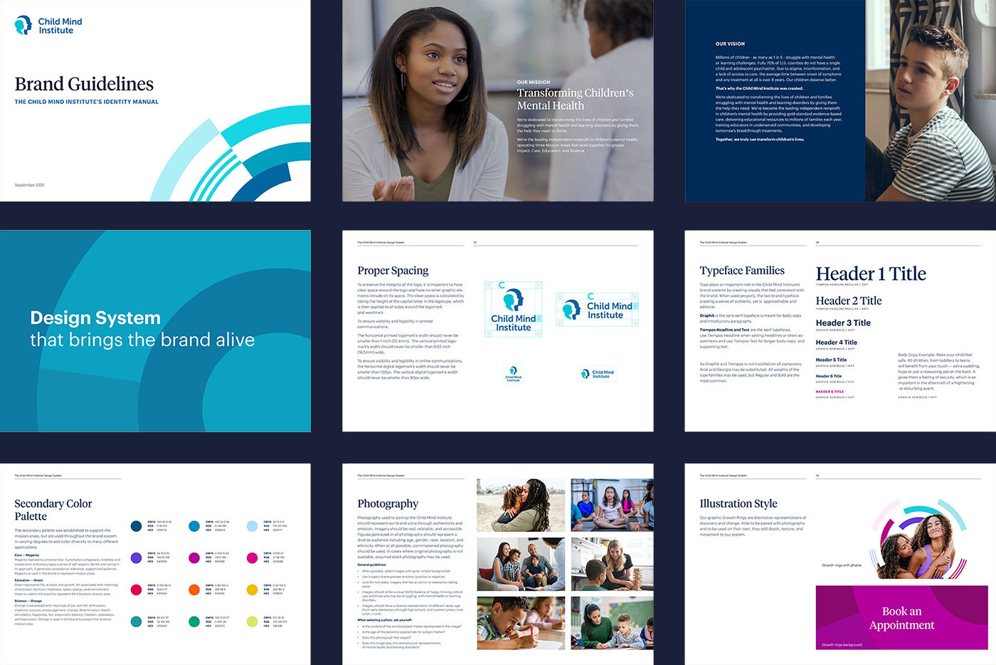
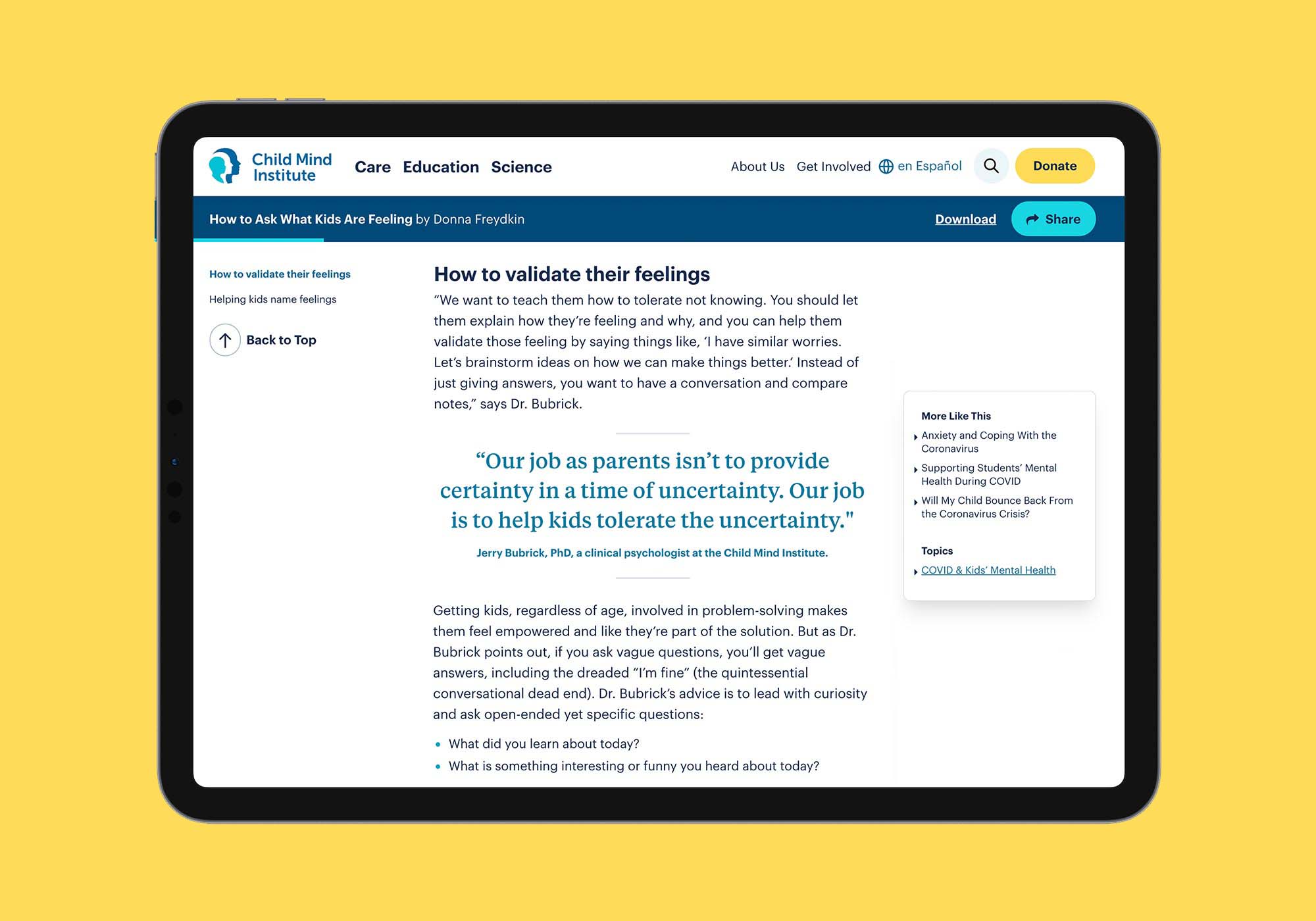
The design was rooted in design principles that we co-created with the CMI team. We choose type families that express a friendly brand tone and are utilitarian enough to support long-form digital publishing.
We created a new color system and illustration style called 'Growth Rings' that expressed emotion while still feeling rational and bright.
A New Family Resource Center
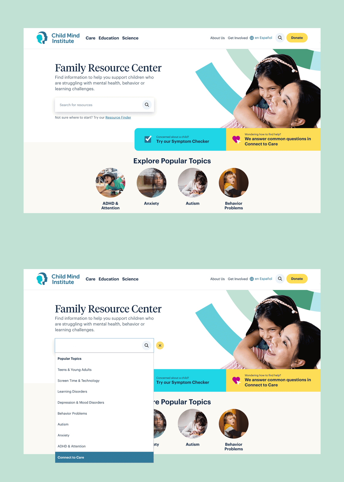
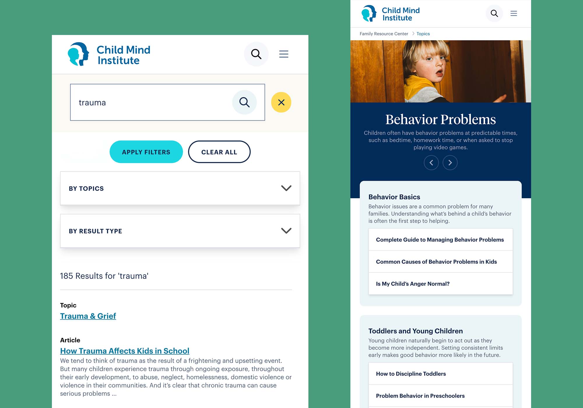
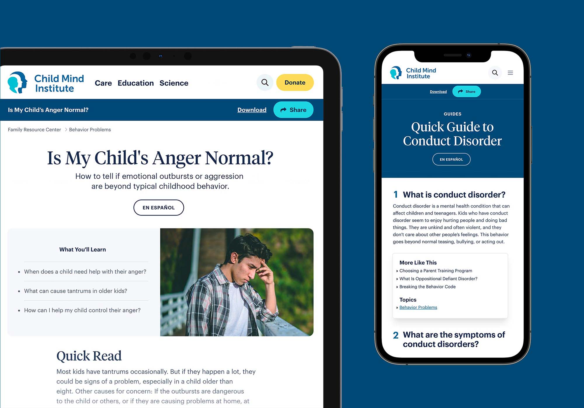
The main focus of the project was to create a new resource portal for families to help support children who are struggling with mental health, behavior, or learning challenges.
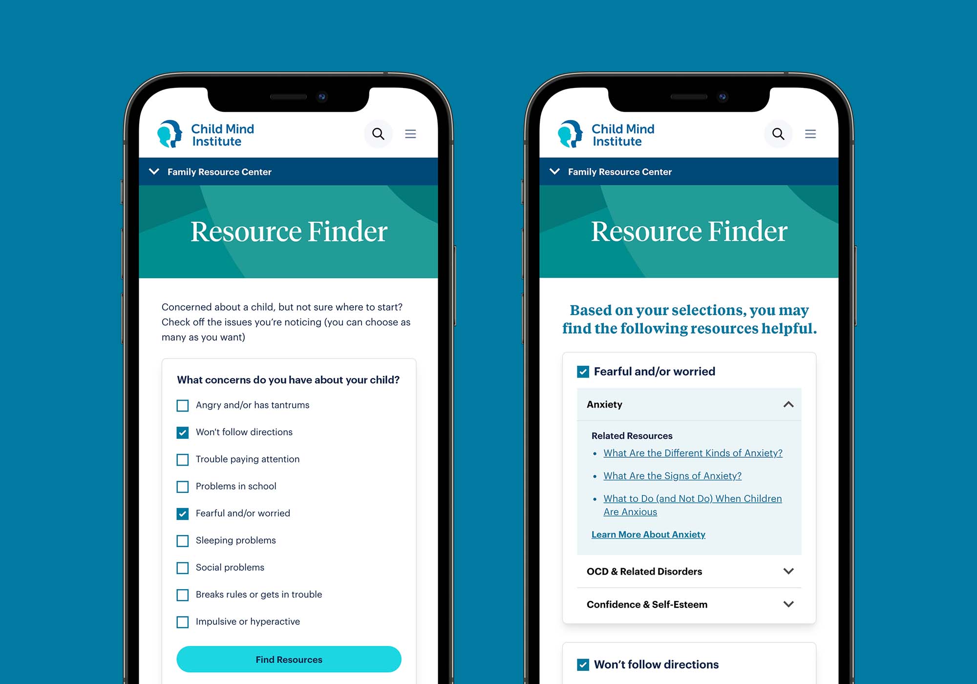
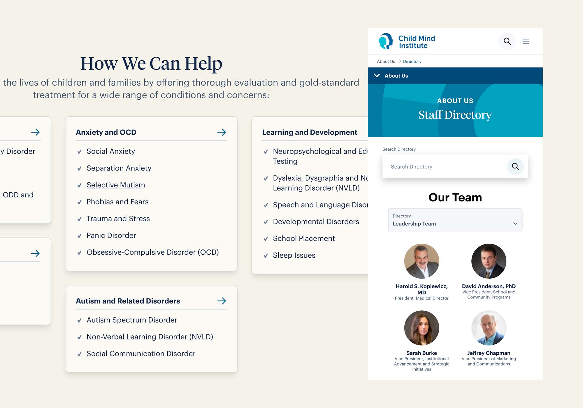
The largest audience challenge was understanding different audience’s emotions to getting the right care. Some families are more comfortable talking about care, while others feel worried and uncertain. We created a positive ‘choose-your-own-adventure’ experience that allows people to access the right resources in different ways.
The multiple ways for families to find the right mental health resources and care:

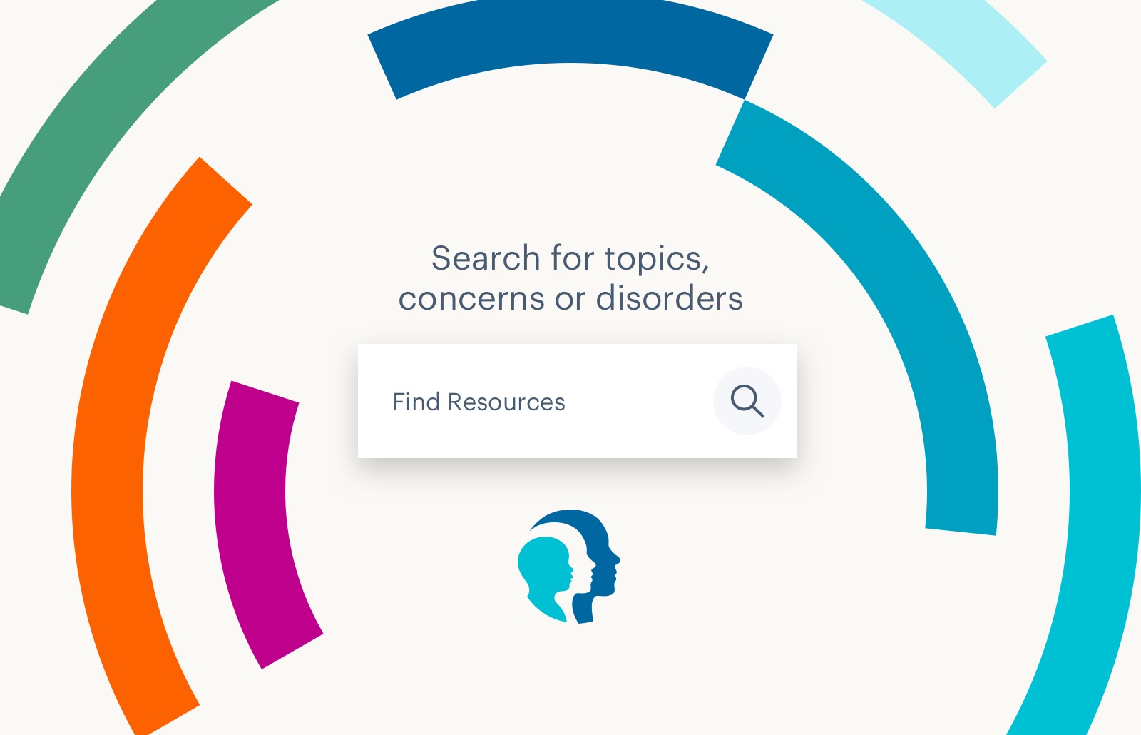
The results speak for themselves
The new site launched September 2021 and has been praised as a success across Child Mind Institute and the families they help. The Child Mind Institute website was awarded a 2022 Webby Awards Honoree for Charitable Organizations/Non-Profit Websites and Mobile Sites
The analytics also point that the site has extensively increased its reach to more families
- Organic Traffic jumped up to a +33.15% YOY increase after the redesign.
- The Resource Center main page and Topics now have about +67% more page views than before.
- Articles have experienced a +18% increase in page views.
The site had a +14.9% increase in the number of visits from Spanish Speaking users.
- Page loads are 31% faster
Users are more likely to visit the Request for an Appointment form (+486% increase in views) which also shows in the increased number of conversions.
- Significant Donations conversion rate improvement (+39.88% YOY)
Credits
Agency: Constructive | Year: 2022
Next Project
Ready to take your visual branding to the next level?
LinkedIn | © Doug Knapton 2024
