Doug Knapton Creates

Doug Knapton Creates

Accessible

Accessible

Accessible

Product Design

Systems that

Scale

His strategic approach combines extensive user research, iterative testing, and data-driven design decisions to deliver solutions that increase conversions, improve accessibility, and strengthen brand recognition. Doug's work has reached over 1 billion people globally and has been recognized by the Webby Awards, Fast Company's Innovation by Design, Indigo Design Award, and Anthem Awards.

Case Study

Child Mind Institute

New and returning users are 486% more likely to reach the Request an Appointment form

Role

Lead UX/UI Designer

Services

Strategy Workshop, Information Architecture, User Testing, Brand Refresh, Website Design

Agency

Constructive

Case Study

Child Mind Institute

New and returning users are 486% more likely to reach the Request an Appointment form

Role

Lead UX/UI Designer

Services

Strategy Workshop, Information Architecture, User Testing, Brand Refresh, Website Design

Agency

Constructive

Case Study

Child Mind Institute

New and returning users are 486% more likely to reach the Request an Appointment form

Role

Lead UX/UI Designer

Services

Strategy Workshop, Information Architecture, User Testing, Brand Refresh, Website Design

Agency

Constructive

Context

The Child Mind Institute is a nonprofit connecting families to children's mental health resources. With over 2,000 guides and resources, the resource product had grown difficult to navigate for the families who needed it most to find help quickly.

As Lead UX/UI Designer, I owned the end-to-end process from user journey mapping to component-level execution, and led a full overhaul of the brand's visual identity. The goal was to redesign the platform to be more intuitive and inclusive, so more families could easily take the crucial next step of requesting an appointment. A key focus was expanding reach to underserved communities like rural, low-income, and Latinx families who often face the greatest barriers to accessing mental health support.

Context

The Child Mind Institute is a nonprofit connecting families to children's mental health resources. With over 2,000 guides and resources, the resource product had grown difficult to navigate for the families who needed it most to find help quickly.

As Lead UX/UI Designer, I owned the end-to-end process from user journey mapping to component-level execution, and led a full overhaul of the brand's visual identity. The goal was to redesign the platform to be more intuitive and inclusive, so more families could easily take the crucial next step of requesting an appointment. A key focus was expanding reach to underserved communities like rural, low-income, and Latinx families who often face the greatest barriers to accessing mental health support.

Context

The Child Mind Institute is a nonprofit connecting families to children's mental health resources. With over 2,000 guides and resources, the resource product had grown difficult to navigate for the families who needed it most to find help quickly.

As Lead UX/UI Designer, I owned the end-to-end process from user journey mapping to component-level execution, and led a full overhaul of the brand's visual identity. The goal was to redesign the platform to be more intuitive and inclusive, so more families could easily take the crucial next step of requesting an appointment. A key focus was expanding reach to underserved communities like rural, low-income, and Latinx families who often face the greatest barriers to accessing mental health support.

Post Launch Results

486% Increase in Appointment Requests Page Views

New and returning users are 486% more likely to visit the Request for an Appointment form, directly translating to an increased number of conversions for clinical care.

+14.9% Expanded Reach to Spanish-Speaking Audiences

The site experienced a +14.9% increase in visits from Spanish-speaking users, demonstrating enhanced inclusivity and broader reach.

31% Faster Web Performance

Page load times improved by 31%, contributing to better user satisfaction and SEO.

Post Launch Results

486% Increase in Appointment Requests Page Views

New and returning users are 486% more likely to visit the Request for an Appointment form, directly translating to an increased number of conversions for clinical care.

+14.9% Expanded Reach to Spanish-Speaking Audiences

The site experienced a +14.9% increase in visits from Spanish-speaking users, demonstrating enhanced inclusivity and broader reach.

31% Faster Web Performance

Page load times improved by 31%, contributing to better user satisfaction and SEO.

Post Launch Results

486% Increase in Appointment Requests Page Views

New and returning users are 486% more likely to visit the Request for an Appointment form, directly translating to an increased number of conversions for clinical care.

+14.9% Expanded Reach to Spanish-Speaking Audiences

The site experienced a +14.9% increase in visits from Spanish-speaking users, demonstrating enhanced inclusivity and broader reach.

31% Faster Web Performance

Page load times improved by 31%, contributing to better user satisfaction and SEO.

Fig 01

Strategy Roots future design decisions back to real user and business outcomes. I synthesized stakeholder input into a strategic roadmap for success metrics across departments spanning Editorial, Engineering, Marketing, and Development.

The Challenge

The design process began with understanding the user's emotional state. I developed several user journey maps backed by analytics that traced different personas’ paths from real-world parenting concerns to booking an appointment at Child Mind Institute. 

It was during the stakeholder workshops that a stark, qualified pain point arose: "95% of people aren't going to make an appointment.

Rather than treating this as an acceptable outcome, I used it as a design brief, asking directly, "How can the design increase the rate?" which led us to brainstorming UX solutions on how to bridge a critical mid-journey user pain point between reading an article and actually booking an appointment.

The Challenge

The design process began with understanding the user's emotional state. I developed several user journey maps backed by analytics that traced different personas’ paths from real-world parenting concerns to booking an appointment at Child Mind Institute. 

It was during the stakeholder workshops that a stark, qualified pain point arose: "95% of people aren't going to make an appointment.

Rather than treating this as an acceptable outcome, I used it as a design brief, asking directly, "How can the design increase the rate?" which led us to brainstorming UX solutions on how to bridge a critical mid-journey user pain point between reading an article and actually booking an appointment.

The Challenge

The design process began with understanding the user's emotional state. I developed several user journey maps backed by analytics that traced different personas’ paths from real-world parenting concerns to booking an appointment at Child Mind Institute. 

It was during the stakeholder workshops that a stark, qualified pain point arose: "95% of people aren't going to make an appointment.

Rather than treating this as an acceptable outcome, I used it as a design brief, asking directly, "How can the design increase the rate?" which led us to brainstorming UX solutions on how to bridge a critical mid-journey user pain point between reading an article and actually booking an appointment.

Fig 01

User Journey Maps grounding the entire UX practice in empathy rather than assumption. This flow charts a parent coming to the site from social media to reaching out to book an appointment.

Process

After doing initial user research on the current site's analytics and mapping user journeys, it was time to start creating wireframe prototypes to test some new features that would help empower families receive the care they needed. Since this website redesign was grounded in service design, it was crucial to do user usability testing to ensure the new features and user flow were intuitive before investing too many resources. The other consideration to keep the project on track was aligning on how to simplify the reusable component library during the wireframe stage.

Process

After doing initial user research on the current site's analytics and mapping user journeys, it was time to start creating wireframe prototypes to test some new features that would help empower families receive the care they needed. Since this website redesign was grounded in service design, it was crucial to do user usability testing to ensure the new features and user flow were intuitive before investing too many resources. The other consideration to keep the project on track was aligning on how to simplify the reusable component library during the wireframe stage.

Process

After doing initial user research on the current site's analytics and mapping user journeys, it was time to start creating wireframe prototypes to test some new features that would help empower families receive the care they needed. Since this website redesign was grounded in service design, it was crucial to do user usability testing to ensure the new features and user flow were intuitive before investing too many resources. The other consideration to keep the project on track was aligning on how to simplify the reusable component library during the wireframe stage.

Fig 03

Usability Testing with real users can quickly reveal issues. I ran several rounds of usability testing on a figma prototype to mitigate potential risk and points of confusion with real users before committing to a full website build. I firmly believe that user testing early in the wireframing process creates better products in the long run.

Fig 05

Cross-Team Collaboration led to a Flexible Multilingual Information Architecture. After performing a thorough audit of over 2,000 articles and guides, I created a new spreadsheet that outlines new and existing post-type and taxonomy that helped stakeholders and development better understand what content needed to be created or migrated from the old site. Since a major project goal was to create a more welcoming experience to Latin families, I worked directly with the Child Mind’s Editorial team to build out the CMS’s flexibility to include spanish fields so the team could customize automatic translations to ensure content felt authentic to native-Spanish families. 

Post Launch Result: The site experienced a +14.9% increase in visits from Spanish-speaking users, demonstrating enhanced inclusivity and broader reach

Fig 05

Cross-Team Collaboration led to a Flexible Multilingual Information Architecture. After performing a thorough audit of over 2,000 articles and guides, I created a new spreadsheet that outlines new and existing post-type and taxonomy that helped stakeholders and development better understand what content needed to be created or migrated from the old site. Since a major project goal was to create a more welcoming experience to Latin families, I worked directly with the Child Mind’s Editorial team to build out the CMS’s flexibility to include spanish fields so the team could customize automatic translations to ensure content felt authentic to native-Spanish families. 

Post Launch Result: The site experienced a +14.9% increase in visits from Spanish-speaking users, demonstrating enhanced inclusivity and broader reach

Fig 05

Cross-Team Collaboration led to a Flexible Multilingual Information Architecture. After performing a thorough audit of over 2,000 articles and guides, I created a new spreadsheet that outlines new and existing post-type and taxonomy that helped stakeholders and development better understand what content needed to be created or migrated from the old site. Since a major project goal was to create a more welcoming experience to Latin families, I worked directly with the Child Mind’s Editorial team to build out the CMS’s flexibility to include spanish fields so the team could customize automatic translations to ensure content felt authentic to native-Spanish families. 

Post Launch Result: The site experienced a +14.9% increase in visits from Spanish-speaking users, demonstrating enhanced inclusivity and broader reach

Fig 06

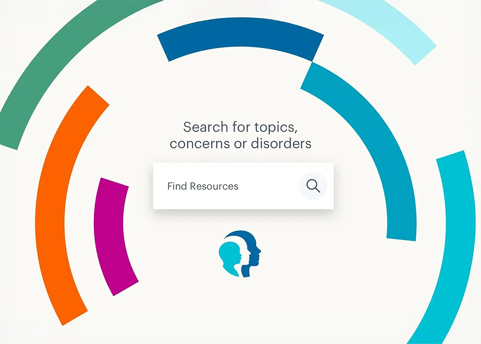
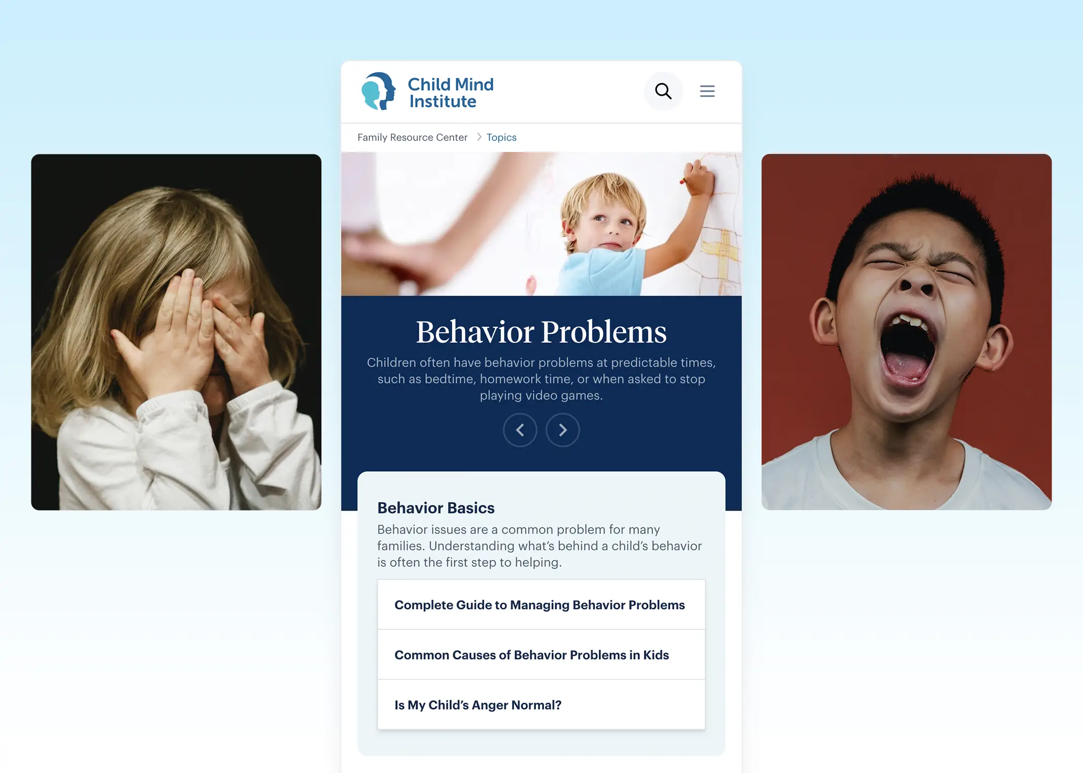
Self-service Pathways turn anxiety into empowerment. A major UX consideration of the redesign was to create a definitive landing page that acts as a self-service pathway that helps serve a high volume of anxious users efficiently. The hero features a prominent search field that includes popular topics when users interact with the field which eases users who aren’t sure where to start. I was intentional in choosing imagery throughout the site that felt like candid moments that would appeal to more diverse families.

Post-Launch Result: The Family Resource Center main page and Topics now have approximately +67% more page views than before, with Articles experiencing an +18% increase in page views.

Fig 06

Self-service Pathways turn anxiety into empowerment. A major UX consideration of the redesign was to create a definitive landing page that acts as a self-service pathway that helps serve a high volume of anxious users efficiently. The hero features a prominent search field that includes popular topics when users interact with the field which eases users who aren’t sure where to start. I was intentional in choosing imagery throughout the site that felt like candid moments that would appeal to more diverse families.

Post-Launch Result: The Family Resource Center main page and Topics now have approximately +67% more page views than before, with Articles experiencing an +18% increase in page views.

Fig 06

Self-service Pathways turn anxiety into empowerment. A major UX consideration of the redesign was to create a definitive landing page that acts as a self-service pathway that helps serve a high volume of anxious users efficiently. The hero features a prominent search field that includes popular topics when users interact with the field which eases users who aren’t sure where to start. I was intentional in choosing imagery throughout the site that felt like candid moments that would appeal to more diverse families.

Post-Launch Result: The Family Resource Center main page and Topics now have approximately +67% more page views than before, with Articles experiencing an +18% increase in page views.

Fig 07

Translate user empathy into structured, scalable interface decisions. I created two new features the Care Journey landing page and Resource Finder tool to solve the core UX challenge of helping worried parents navigate complex, emotionally sensitive information without feeling overwhelmed.

Fig 08

Versatile Type System that Creates Editorial Credibility. After several collaborative conversations with the Child Mind team about the brand attributes, I selected two type families that balanced the brand’s credibility while still feeling approachable and fun. I created a supporting Brand Guideline that outlined typography hierarchy and usage for the internal team to refer back to when creating future communication.

Fig 01

A Flexible Design System that brings the brand to life. I overhauled their design system which included an extensive color palette and an expressive new illustration style called ‘Growth Rings’. The design system is bright and optimistic while still feeling rational and evidence-based. The consistent visual identity across the entire website reinforces credibility at every touchpoint.

Outcomes

The new Child Mind Institute website has been widely praised and has delivered significant, quantifiable results:

  • Significant Organic Traffic Growth: Organic traffic jumped up to a +33.15% Year-Over-Year increase after the redesign, indicating strong SEO performance.

  • Increased Resource Engagement: The Family Resource Center main page and Topics now have approximately +67% more page views than before, with Articles experiencing an +18% increase in page views.

  • Improved Donation Conversion: The site saw a significant +39.88% Year-Over-Year improvement in Donations conversion rates, showcasing the impact on fundraising.

  • Award-Winning Recognition: The Child Mind Institute website was honored as a 2022 Webby Awards Honoree for Charitable Organizations/Non-Profit Websites and Mobile Sites, acknowledging its excellence in design and impact.

Outcomes

The new Child Mind Institute website has been widely praised and has delivered significant, quantifiable results:

  • Significant Organic Traffic Growth: Organic traffic jumped up to a +33.15% Year-Over-Year increase after the redesign, indicating strong SEO performance.

  • Increased Resource Engagement: The Family Resource Center main page and Topics now have approximately +67% more page views than before, with Articles experiencing an +18% increase in page views.

  • Improved Donation Conversion: The site saw a significant +39.88% Year-Over-Year improvement in Donations conversion rates, showcasing the impact on fundraising.

  • Award-Winning Recognition: The Child Mind Institute website was honored as a 2022 Webby Awards Honoree for Charitable Organizations/Non-Profit Websites and Mobile Sites, acknowledging its excellence in design and impact.

Outcomes

The new Child Mind Institute website has been widely praised and has delivered significant, quantifiable results:

  • Significant Organic Traffic Growth: Organic traffic jumped up to a +33.15% Year-Over-Year increase after the redesign, indicating strong SEO performance.

  • Increased Resource Engagement: The Family Resource Center main page and Topics now have approximately +67% more page views than before, with Articles experiencing an +18% increase in page views.

  • Improved Donation Conversion: The site saw a significant +39.88% Year-Over-Year improvement in Donations conversion rates, showcasing the impact on fundraising.

  • Award-Winning Recognition: The Child Mind Institute website was honored as a 2022 Webby Awards Honoree for Charitable Organizations/Non-Profit Websites and Mobile Sites, acknowledging its excellence in design and impact.

Reflections

User Testing can reveal unconscious habits that inform scalable, reusable patterns. During usability testing, I noticed users consistently ignored content placed in the sidebars. That insight led me to restructure the layout, moving key information from the sidebar into the center of the page which improved content visibility. Testing on real users can also reveal ambitious feature requests, like audio recordings, that fell outside the initial scope. Rather than dismiss them, I documented them to inform the product roadmap beyond launch.

Reflections

User Testing can reveal unconscious habits that inform scalable, reusable patterns. During usability testing, I noticed users consistently ignored content placed in the sidebars. That insight led me to restructure the layout, moving key information from the sidebar into the center of the page which improved content visibility. Testing on real users can also reveal ambitious feature requests, like audio recordings, that fell outside the initial scope. Rather than dismiss them, I documented them to inform the product roadmap beyond launch.

Reflections

User Testing can reveal unconscious habits that inform scalable, reusable patterns. During usability testing, I noticed users consistently ignored content placed in the sidebars. That insight led me to restructure the layout, moving key information from the sidebar into the center of the page which improved content visibility. Testing on real users can also reveal ambitious feature requests, like audio recordings, that fell outside the initial scope. Rather than dismiss them, I documented them to inform the product roadmap beyond launch.

Case Study

The Chronicle of Philanthropy

A design system sprint that unified web, magazine, and account experiences

Role

Lead UI Designer

Services

Design System, Component Library

Agency

Constructive

Case Study

The Chronicle of Philanthropy

A design system sprint that unified web, magazine, and account experiences

Role

Lead UI Designer

Services

Design System, Component Library

Agency

Constructive

Case Study

The Chronicle of Philanthropy

A design system sprint that unified web, magazine, and account experiences

Role

Lead UI Designer

Services

Design System, Component Library

Agency

Constructive

Context

The Chronicle of Philanthropy is an iconic publication with 30+ years of rigorous journalistic coverage for the social sector. Faced with the changing landscape of publishing, The Chronicle wanted to establish a new design system that would reinvigorate their online brand presence and amplify their new professional development service offering.

As Lead UI Designer, I owned the creation of their new design system from the ground up and partnered with product engineers to deliver consistent and intuitive experiences across every surface.

The Challenge

There were a few real constraints that I had to navigate to deliver high-quality results on time:

A four-month timeline. With a firm project timeline of 4 months from kickoff to launch, time was the largest constraint. I worked closely with the project team to map out 5 two-week iterative UX/UI sprints that account for over 40+ design components and ensure proper client feedback cycles. 

Creating Trust Between Disciplines. Aside from the time constraint, the harder problem was how to create a single source of truth between the Chronicle's design team and their external engineering team. The challenge was not designing a fixed library of components. It was building a system that could support consistent decision-making that could scale across distributed teams.

Context

The Chronicle of Philanthropy is an iconic publication with 30+ years of rigorous journalistic coverage for the social sector. Faced with the changing landscape of publishing, The Chronicle wanted to establish a new design system that would reinvigorate their online brand presence and amplify their new professional development service offering.

As Lead UI Designer, I owned the creation of their new design system from the ground up and partnered with product engineers to deliver consistent and intuitive experiences across every surface.

The Challenge

There were a few real constraints that I had to navigate to deliver high-quality results on time:

A four-month timeline. With a firm project timeline of 4 months from kickoff to launch, time was the largest constraint. I worked closely with the project team to map out 5 two-week iterative UX/UI sprints that account for over 40+ design components and ensure proper client feedback cycles. 

Creating Trust Between Disciplines. Aside from the time constraint, the harder problem was how to create a single source of truth between the Chronicle's design team and their external engineering team. The challenge was not designing a fixed library of components. It was building a system that could support consistent decision-making that could scale across distributed teams.

Context

The Chronicle of Philanthropy is an iconic publication with 30+ years of rigorous journalistic coverage for the social sector. Faced with the changing landscape of publishing, The Chronicle wanted to establish a new design system that would reinvigorate their online brand presence and amplify their new professional development service offering.

As Lead UI Designer, I owned the creation of their new design system from the ground up and partnered with product engineers to deliver consistent and intuitive experiences across every surface.

The Challenge

There were a few real constraints that I had to navigate to deliver high-quality results on time:

A four-month timeline. With a firm project timeline of 4 months from kickoff to launch, time was the largest constraint. I worked closely with the project team to map out 5 two-week iterative UX/UI sprints that account for over 40+ design components and ensure proper client feedback cycles. 

Creating Trust Between Disciplines. Aside from the time constraint, the harder problem was how to create a single source of truth between the Chronicle's design team and their external engineering team. The challenge was not designing a fixed library of components. It was building a system that could support consistent decision-making that could scale across distributed teams.

Fig 01

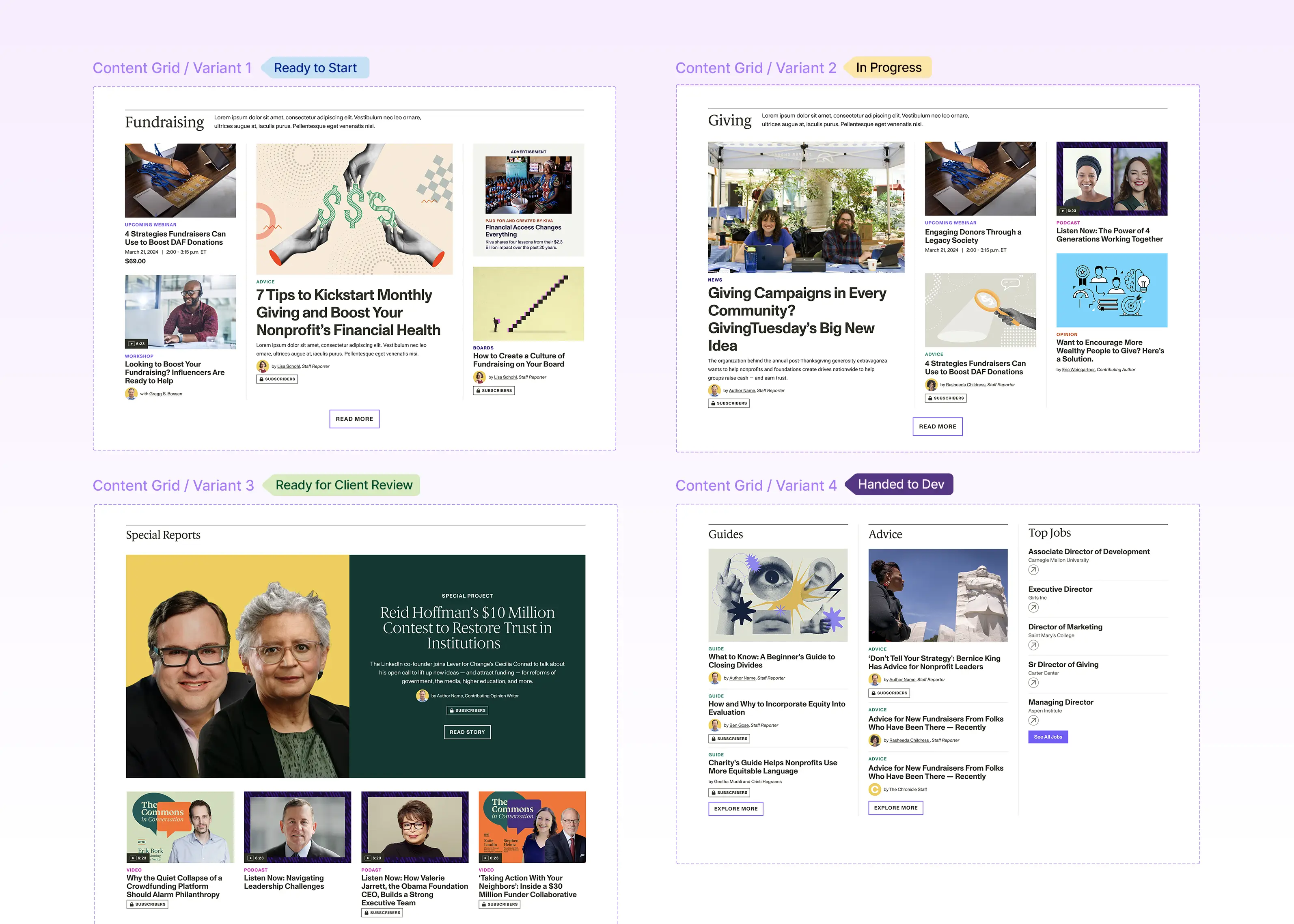
The Sprint Timeline was organized to prioritize creating the foundation of design tokens early on to then scale production to over 40+ reusable components

Process

I approached the design system as an organizational opportunity, focusing on creating a structure that future teams would actually use while giving it a solid foundation for scalability.

Design Tokens first, Components second. Before designing a single component, I established the design token foundation of color, type presets, and spacing. Once the client and I aligned on their editorial typeface choice and their vibrant gem-tone color palette, I documented the design tokens to be reusable throughout the library. That groundwork made the process of designing over 40+ reusable components to be rapid because the key design decisions were already approved and documented.

One Figma workspace as the shared source of truth. After a few rounds of client feedback, it became apparent that we needed a single source of truth outside the working files and presentations. The solution was to create a shared figma workspace between all the  teams that would include all approved design artifacts. Since this design library would only include finalized files, it made the handoff to engineering more transparent and reliable.

Early QA made System Building More Streamlined.

I took ownership in performing Quality Assurance on the engineers’ initial Pull Request (PR) for the design tokens before component design work ramped up. By aligning early on in the process, we were able to accelerate trust between teams and establish a solid foundation before the component library iterated incrementally with each new sprint.

Process

I approached the design system as an organizational opportunity, focusing on creating a structure that future teams would actually use while giving it a solid foundation for scalability.

Design Tokens first, Components second. Before designing a single component, I established the design token foundation of color, type presets, and spacing. Once the client and I aligned on their editorial typeface choice and their vibrant gem-tone color palette, I documented the design tokens to be reusable throughout the library. That groundwork made the process of designing over 40+ reusable components to be rapid because the key design decisions were already approved and documented.

One Figma workspace as the shared source of truth. After a few rounds of client feedback, it became apparent that we needed a single source of truth outside the working files and presentations. The solution was to create a shared figma workspace between all the  teams that would include all approved design artifacts. Since this design library would only include finalized files, it made the handoff to engineering more transparent and reliable.

Early QA made System Building More Streamlined.

I took ownership in performing Quality Assurance on the engineers’ initial Pull Request (PR) for the design tokens before component design work ramped up. By aligning early on in the process, we were able to accelerate trust between teams and establish a solid foundation before the component library iterated incrementally with each new sprint.

Process

I approached the design system as an organizational opportunity, focusing on creating a structure that future teams would actually use while giving it a solid foundation for scalability.

Design Tokens first, Components second. Before designing a single component, I established the design token foundation of color, type presets, and spacing. Once the client and I aligned on their editorial typeface choice and their vibrant gem-tone color palette, I documented the design tokens to be reusable throughout the library. That groundwork made the process of designing over 40+ reusable components to be rapid because the key design decisions were already approved and documented.

One Figma workspace as the shared source of truth. After a few rounds of client feedback, it became apparent that we needed a single source of truth outside the working files and presentations. The solution was to create a shared figma workspace between all the  teams that would include all approved design artifacts. Since this design library would only include finalized files, it made the handoff to engineering more transparent and reliable.

Early QA made System Building More Streamlined.

I took ownership in performing Quality Assurance on the engineers’ initial Pull Request (PR) for the design tokens before component design work ramped up. By aligning early on in the process, we were able to accelerate trust between teams and establish a solid foundation before the component library iterated incrementally with each new sprint.

Fig 02

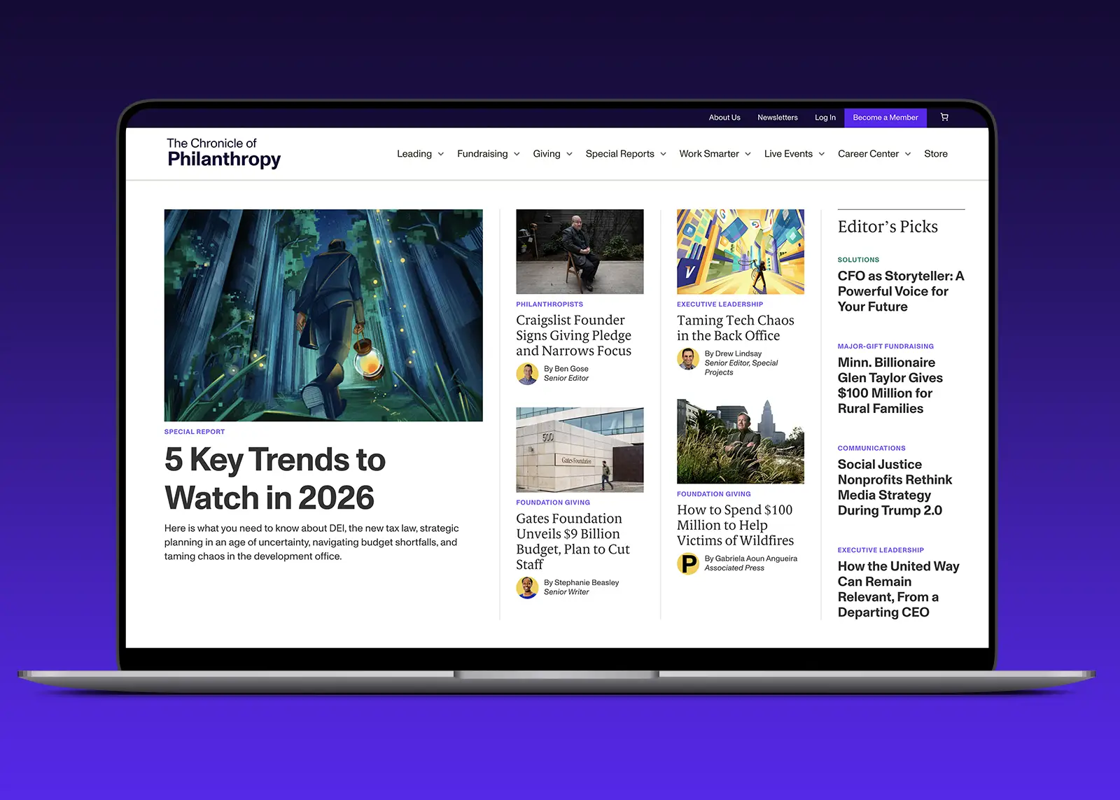
The vibrant gem-tone color palette was applied to content eyebrows to differentiate post-type throughout the site. Having an extensive brand palette empowered the Chronicle's Social team to experiment on creating bold content while being on-brand.

Fig 03

Adding ‘In-Progress’ labels to the components throughout the sprints made cross-discipline communication more transparent.

Fig 04

Documenting the responsive Type Scale as a design token gave the whole system a consistent foundation for editorial hierarchy.

Outcome

Cleaner Aesthetic for both Magazine Redesign and Design System: My work on the design system not only affected the website design, but also guided the redesign of The Chronicle of Philanthropy's Magazine. I worked directly with the Chronicle’s Art Director to optimize the colors for printing and ensure the type hierarchy was consistent with how it appears on the web components. The overall reception of the redesign was extremely positive.

Revamped UX that streamlines learning verticals and new practical tools: The new website reorganizes content into new verticals (Leading, Fundraising, Giving) to better align with how their different audience types engage with their content. The website also houses new resources and toolkits that expand the Chronicle beyond news and into professional development offerings.

Outcome

Cleaner Aesthetic for both Magazine Redesign and Design System: My work on the design system not only affected the website design, but also guided the redesign of The Chronicle of Philanthropy's Magazine. I worked directly with the Chronicle’s Art Director to optimize the colors for printing and ensure the type hierarchy was consistent with how it appears on the web components. The overall reception of the redesign was extremely positive.

Revamped UX that streamlines learning verticals and new practical tools: The new website reorganizes content into new verticals (Leading, Fundraising, Giving) to better align with how their different audience types engage with their content. The website also houses new resources and toolkits that expand the Chronicle beyond news and into professional development offerings.

Outcome

Cleaner Aesthetic for both Magazine Redesign and Design System: My work on the design system not only affected the website design, but also guided the redesign of The Chronicle of Philanthropy's Magazine. I worked directly with the Chronicle’s Art Director to optimize the colors for printing and ensure the type hierarchy was consistent with how it appears on the web components. The overall reception of the redesign was extremely positive.

Revamped UX that streamlines learning verticals and new practical tools: The new website reorganizes content into new verticals (Leading, Fundraising, Giving) to better align with how their different audience types engage with their content. The website also houses new resources and toolkits that expand the Chronicle beyond news and into professional development offerings.

Deep Dive: Accounts Benefit Redesign

I ran a separate design sprint and stakeholder workshop specifically to address recurring pain points in the Account Benefits section. Here are some results:

Reduce Cognitive Load. My main recommendation was to consolidate related navigation actions like ‘Profile & Settings’ and ‘Privacy Settings’ into single pages like ‘Account Details’ to reduce the amount of navigation options. I also designed nav icons to give instant context  which led to quicker decision making.

Benefits front and center. By making the ‘My Benefits’ page the ‘homepage’ within the Account section, the page gave users a more clear view of what was included in their membership. 

Clearer Visual Hierarchy. I implemented Grouped related items to make the dashboard easier to scan for new and returning users.

Membership value made explicit. I designed a prominent Call-to-Action at the top to highlight member’s largest benefit of accessing the Chronicle's library behind the paywall. I also created a secondary upgrade membership CTA so users better understand the benefits of updating to a higher membership tier.

Deep Dive: Accounts Benefit Redesign

I ran a separate design sprint and stakeholder workshop specifically to address recurring pain points in the Account Benefits section. Here are some results:

Reduce Cognitive Load. My main recommendation was to consolidate related navigation actions like ‘Profile & Settings’ and ‘Privacy Settings’ into single pages like ‘Account Details’ to reduce the amount of navigation options. I also designed nav icons to give instant context  which led to quicker decision making.

Benefits front and center. By making the ‘My Benefits’ page the ‘homepage’ within the Account section, the page gave users a more clear view of what was included in their membership. 

Clearer Visual Hierarchy. I implemented Grouped related items to make the dashboard easier to scan for new and returning users.

Membership value made explicit. I designed a prominent Call-to-Action at the top to highlight member’s largest benefit of accessing the Chronicle's library behind the paywall. I also created a secondary upgrade membership CTA so users better understand the benefits of updating to a higher membership tier.

Deep Dive: Accounts Benefit Redesign

I ran a separate design sprint and stakeholder workshop specifically to address recurring pain points in the Account Benefits section. Here are some results:

Reduce Cognitive Load. My main recommendation was to consolidate related navigation actions like ‘Profile & Settings’ and ‘Privacy Settings’ into single pages like ‘Account Details’ to reduce the amount of navigation options. I also designed nav icons to give instant context  which led to quicker decision making.

Benefits front and center. By making the ‘My Benefits’ page the ‘homepage’ within the Account section, the page gave users a more clear view of what was included in their membership. 

Clearer Visual Hierarchy. I implemented Grouped related items to make the dashboard easier to scan for new and returning users.

Membership value made explicit. I designed a prominent Call-to-Action at the top to highlight member’s largest benefit of accessing the Chronicle's library behind the paywall. I also created a secondary upgrade membership CTA so users better understand the benefits of updating to a higher membership tier.

Fig 05

The Account Benefit section redesign was a good test of whether the new system could hold up under the Chronicle's Customer Relationship Management.

Reflections

QA needs proper time. It’s one thing to deliver an exceptional well-documented design system within figma, but the implementation process is completely different. It was challenging within the condensed timeline to perform appropriate quality assurance because everyone was sprinting to finish the work before launch. In retrospect, I wish we were a bit more aligned with the external development team during the QA phase so we were able to polish the experience a bit more. I believe excellence comes from the small details and interactions, so it’s always important to carve out enough time to collaborate with engineers to make the product shine.

Labeling progress is crucial to cross-team communication. One obstacle I ran into early in the process was how to successfully communicate with multiple people about the progress of certain components. I collaborated with the project team on a color label system across figma and asana that notates where each component is, spanning from “in-progress”,”internal review”, “ready for client feedback”, and finally “Handed to the Developer”. This simple yet effective flag was able to signal across all teams the overall project progress.

Reflections

QA needs proper time. It’s one thing to deliver an exceptional well-documented design system within figma, but the implementation process is completely different. It was challenging within the condensed timeline to perform appropriate quality assurance because everyone was sprinting to finish the work before launch. In retrospect, I wish we were a bit more aligned with the external development team during the QA phase so we were able to polish the experience a bit more. I believe excellence comes from the small details and interactions, so it’s always important to carve out enough time to collaborate with engineers to make the product shine.

Labeling progress is crucial to cross-team communication. One obstacle I ran into early in the process was how to successfully communicate with multiple people about the progress of certain components. I collaborated with the project team on a color label system across figma and asana that notates where each component is, spanning from “in-progress”,”internal review”, “ready for client feedback”, and finally “Handed to the Developer”. This simple yet effective flag was able to signal across all teams the overall project progress.

Reflections

QA needs proper time. It’s one thing to deliver an exceptional well-documented design system within figma, but the implementation process is completely different. It was challenging within the condensed timeline to perform appropriate quality assurance because everyone was sprinting to finish the work before launch. In retrospect, I wish we were a bit more aligned with the external development team during the QA phase so we were able to polish the experience a bit more. I believe excellence comes from the small details and interactions, so it’s always important to carve out enough time to collaborate with engineers to make the product shine.

Labeling progress is crucial to cross-team communication. One obstacle I ran into early in the process was how to successfully communicate with multiple people about the progress of certain components. I collaborated with the project team on a color label system across figma and asana that notates where each component is, spanning from “in-progress”,”internal review”, “ready for client feedback”, and finally “Handed to the Developer”. This simple yet effective flag was able to signal across all teams the overall project progress.

Case Study

Air Quality Life Index

Educating over 1 billion people about the health consequences of air pollution

Role

Lead UX/UI Designer

Services

Website Design, Data Visualization

Agency

Constructive

Case Study

Air Quality Life Index

Educating over 1 billion people about the health consequences of air pollution

Role

Lead UX/UI Designer

Services

Website Design, Data Visualization

Agency

Constructive

Case Study

Air Quality Life Index

Educating over 1 billion people about the health consequences of air pollution

Role

Lead UX/UI Designer

Services

Website Design, Data Visualization

Agency

Constructive

Context

The Energy Policy Institute at the University of Chicago (EPIC) quantified the causal relationship between air pollution and life expectancy, but had a challenge with how to visualize the complex data in an engaging way that educated the public and empowered policymaker leaders with actionable insights to introduce more sustainable legislation. 

As Lead UX/UI Designer, my role was to define this revolutionary zero-to-one public data product and design supporting brand expressions like research reports and explainer graphics.

The Challenge

The major constraint creating the AQLI was identifying the right technical infrastructure. I collaborated directly with a full-stack developer to identify the proper dev environment that would support 25+ years of global satellite data. The other challenge was how to educate first-time users on all uChicago’s technical research terminology. Many first time users during usability testing cited they thought the index showed pollution rates, when the index actually shows “Life Years Saved if Countries Reduce their Air Pollution to meet WHO Standard.” I designed a suite of air pollution explainers visualizations to communicate the index’s more abstract metric to everyday people who are engaging with the tool.

Context

The Energy Policy Institute at the University of Chicago (EPIC) quantified the causal relationship between air pollution and life expectancy, but had a challenge with how to visualize the complex data in an engaging way that educated the public and empowered policymaker leaders with actionable insights to introduce more sustainable legislation. 

As Lead UX/UI Designer, my role was to define this revolutionary zero-to-one public data product and design supporting brand expressions like research reports and explainer graphics.

The Challenge

The major constraint creating the AQLI was identifying the right technical infrastructure. I collaborated directly with a full-stack developer to identify the proper dev environment that would support 25+ years of global satellite data. The other challenge was how to educate first-time users on all uChicago’s technical research terminology. Many first time users during usability testing cited they thought the index showed pollution rates, when the index actually shows “Life Years Saved if Countries Reduce their Air Pollution to meet WHO Standard.” I designed a suite of air pollution explainers visualizations to communicate the index’s more abstract metric to everyday people who are engaging with the tool.

Context

The Energy Policy Institute at the University of Chicago (EPIC) quantified the causal relationship between air pollution and life expectancy, but had a challenge with how to visualize the complex data in an engaging way that educated the public and empowered policymaker leaders with actionable insights to introduce more sustainable legislation. 

As Lead UX/UI Designer, my role was to define this revolutionary zero-to-one public data product and design supporting brand expressions like research reports and explainer graphics.

The Challenge

The major constraint creating the AQLI was identifying the right technical infrastructure. I collaborated directly with a full-stack developer to identify the proper dev environment that would support 25+ years of global satellite data. The other challenge was how to educate first-time users on all uChicago’s technical research terminology. Many first time users during usability testing cited they thought the index showed pollution rates, when the index actually shows “Life Years Saved if Countries Reduce their Air Pollution to meet WHO Standard.” I designed a suite of air pollution explainers visualizations to communicate the index’s more abstract metric to everyday people who are engaging with the tool.

Fig 01

I developed these supporting graphics to better explain what particulate pollution is and how it affects human health. They appeared on the website and research reports.

Fig 02

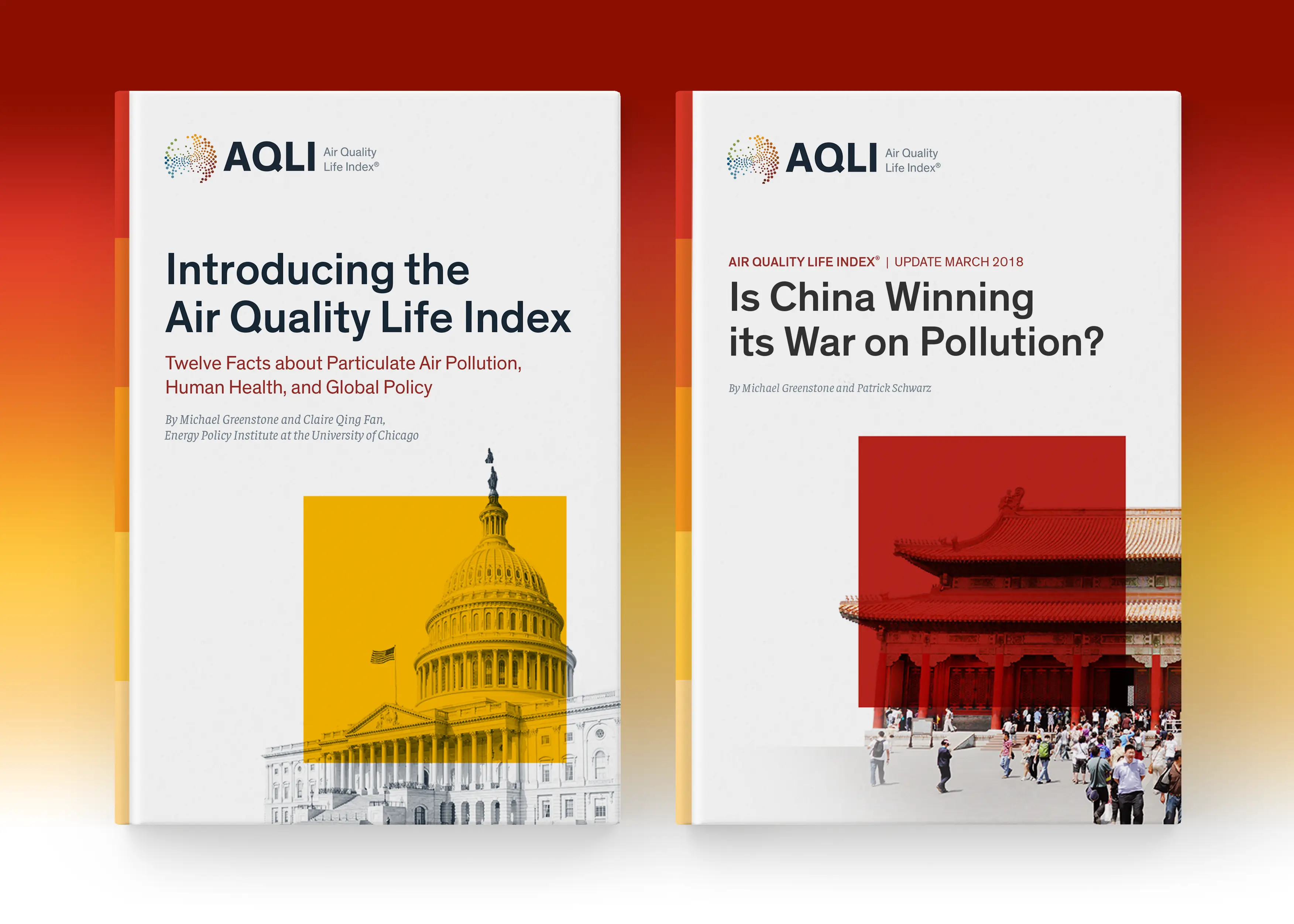
Editorial Report Design. I designed several research reports introducing the AQLI research to the public. The covers borrow the Index’s legend as a visual metaphor to show how certain countries’ air pollution stacks up against each other.

Process

I conducted a series of three iterative rounds of user testing wireframe prototype to better test user assumptions and subject matter proficiency. 

Some key insights were:

  • First-time users were initially overwhelmed and requested primer content and optional ‘get help’ walkthrough tutorials

  • Users asked for explanatory tooltips to better understand the visualization’s subject matter

  • Users needed city markers to better position themselves in the experiences (we initially only scoped for country and state/region/providence borders)

Process

I conducted a series of three iterative rounds of user testing wireframe prototype to better test user assumptions and subject matter proficiency. 

Some key insights were:

  • First-time users were initially overwhelmed and requested primer content and optional ‘get help’ walkthrough tutorials

  • Users asked for explanatory tooltips to better understand the visualization’s subject matter

  • Users needed city markers to better position themselves in the experiences (we initially only scoped for country and state/region/providence borders)

Process

I conducted a series of three iterative rounds of user testing wireframe prototype to better test user assumptions and subject matter proficiency. 

Some key insights were:

  • First-time users were initially overwhelmed and requested primer content and optional ‘get help’ walkthrough tutorials

  • Users asked for explanatory tooltips to better understand the visualization’s subject matter

  • Users needed city markers to better position themselves in the experiences (we initially only scoped for country and state/region/providence borders)

Fig 03

User testing was a crucial step in the process because it helped uncover a lot of biased assumptions we made as a project team because we were closer to the research and brand narrative.

Fig 04

I developed this explainer modal that helped clarify the index’s legend and what it is tracking. It helped to educate first-time users on the subject matter.

Fig 05

Video Demo showing key functionality of the index

Fig 05

Video Demo showing key functionality of the index

Fig 05

Video Demo showing key functionality of the index

Fig 06

The website design mirrors’ the visual language established in the index.  Early in the process, we quickly realized the tool would eventually have to be multilingual to support its growing interest of international policymakers. 

I consulted with several independent contractors to better understand how to localize the index for different languages. We relied on Google Translate API to translate the entire site and index into Mandarin and Hindi to meet significant reach in China, India, and Pakistan. UX Localization is a newer discipline for me, but was endlessly fascinating.

Outcomes

The AQLI has received coverage from more than 300 media outlets, reaching more than 1.1 billion people globally in both top-tier and local outlets across print, digital, television, and radio platforms. 

The AQLI has been supported by environmentalists Greta Thunberg, Leonardo DiCaprio, and Pakistan’s former Minister for Climate/Environment Sherry Rehman, and used  by human rights committees in India and Human Rights Watch in Pakistan to justify action. The AQLI has helped drive the development of a clean air bill in India, and has been used to justify policy changes by Members of Parliament in the United Kingdom, India, and Pakistan. It has also been used as evidence in a landmark Indonesian court ruling that found the Jakarta government needed to do more to protect its people.

The Index has been recognized as a ‘World Changing Idea’ by Fast Company magazine and as the “gold standard on air quality research” in The New York Times.

Reflection

The data visualization needs to be an effective tool for both experts and the public. Early on in the process, I identified that the product’s different audience types needed different content and engaged with the tool differently. Everyday users were most curious about the big-picture takeaway and how their location’s air pollution compared with other places. Policy leaders needed supporting data evidence and pages explaining the methodology to help inform local legislation. I helped craft the digital strategy to outline types of content each audience would need to be an effective tool for everyone. 

A truly international tool needs to be multilingual. Early in the process, we quickly realized the tool would eventually have to be multilingual to support its growing interest of international policymakers. I consulted with several independent contractors to better understand how to localize the index for different languages. We relied on Google Translate API to translate the entire site and index into Mandarin and Hindi to meet significant reach in China, India, and Pakistan. UX Localization is a newer discipline for me, but was endlessly fascinating.

Outcomes

The AQLI has received coverage from more than 300 media outlets, reaching more than 1.1 billion people globally in both top-tier and local outlets across print, digital, television, and radio platforms. 

The AQLI has been supported by environmentalists Greta Thunberg, Leonardo DiCaprio, and Pakistan’s former Minister for Climate/Environment Sherry Rehman, and used  by human rights committees in India and Human Rights Watch in Pakistan to justify action. The AQLI has helped drive the development of a clean air bill in India, and has been used to justify policy changes by Members of Parliament in the United Kingdom, India, and Pakistan. It has also been used as evidence in a landmark Indonesian court ruling that found the Jakarta government needed to do more to protect its people.

The Index has been recognized as a ‘World Changing Idea’ by Fast Company magazine and as the “gold standard on air quality research” in The New York Times.

Reflection

The data visualization needs to be an effective tool for both experts and the public. Early on in the process, I identified that the product’s different audience types needed different content and engaged with the tool differently. Everyday users were most curious about the big-picture takeaway and how their location’s air pollution compared with other places. Policy leaders needed supporting data evidence and pages explaining the methodology to help inform local legislation. I helped craft the digital strategy to outline types of content each audience would need to be an effective tool for everyone. 

A truly international tool needs to be multilingual. Early in the process, we quickly realized the tool would eventually have to be multilingual to support its growing interest of international policymakers. I consulted with several independent contractors to better understand how to localize the index for different languages. We relied on Google Translate API to translate the entire site and index into Mandarin and Hindi to meet significant reach in China, India, and Pakistan. UX Localization is a newer discipline for me, but was endlessly fascinating.

Outcomes

The AQLI has received coverage from more than 300 media outlets, reaching more than 1.1 billion people globally in both top-tier and local outlets across print, digital, television, and radio platforms. 

The AQLI has been supported by environmentalists Greta Thunberg, Leonardo DiCaprio, and Pakistan’s former Minister for Climate/Environment Sherry Rehman, and used  by human rights committees in India and Human Rights Watch in Pakistan to justify action. The AQLI has helped drive the development of a clean air bill in India, and has been used to justify policy changes by Members of Parliament in the United Kingdom, India, and Pakistan. It has also been used as evidence in a landmark Indonesian court ruling that found the Jakarta government needed to do more to protect its people.

The Index has been recognized as a ‘World Changing Idea’ by Fast Company magazine and as the “gold standard on air quality research” in The New York Times.

Reflection

The data visualization needs to be an effective tool for both experts and the public. Early on in the process, I identified that the product’s different audience types needed different content and engaged with the tool differently. Everyday users were most curious about the big-picture takeaway and how their location’s air pollution compared with other places. Policy leaders needed supporting data evidence and pages explaining the methodology to help inform local legislation. I helped craft the digital strategy to outline types of content each audience would need to be an effective tool for everyone. 

A truly international tool needs to be multilingual. Early in the process, we quickly realized the tool would eventually have to be multilingual to support its growing interest of international policymakers. I consulted with several independent contractors to better understand how to localize the index for different languages. We relied on Google Translate API to translate the entire site and index into Mandarin and Hindi to meet significant reach in China, India, and Pakistan. UX Localization is a newer discipline for me, but was endlessly fascinating.

Let's Talk

I'm currently available for new projects and roles.

Feel free to contact me with the details, and I'll follow up quickly.

© Copyright 2026. All Rights Reserved by Doug Knapton

Let's Talk

I'm currently available for new projects and roles.

Feel free to contact me with the details, and I'll follow up quickly.

© Copyright 2026. All Rights Reserved by Doug Knapton

Let's Talk

I'm currently available for new projects and roles.

Feel free to contact me with the details, and I'll follow up quickly.

© Copyright 2026. All Rights Reserved by Doug Knapton